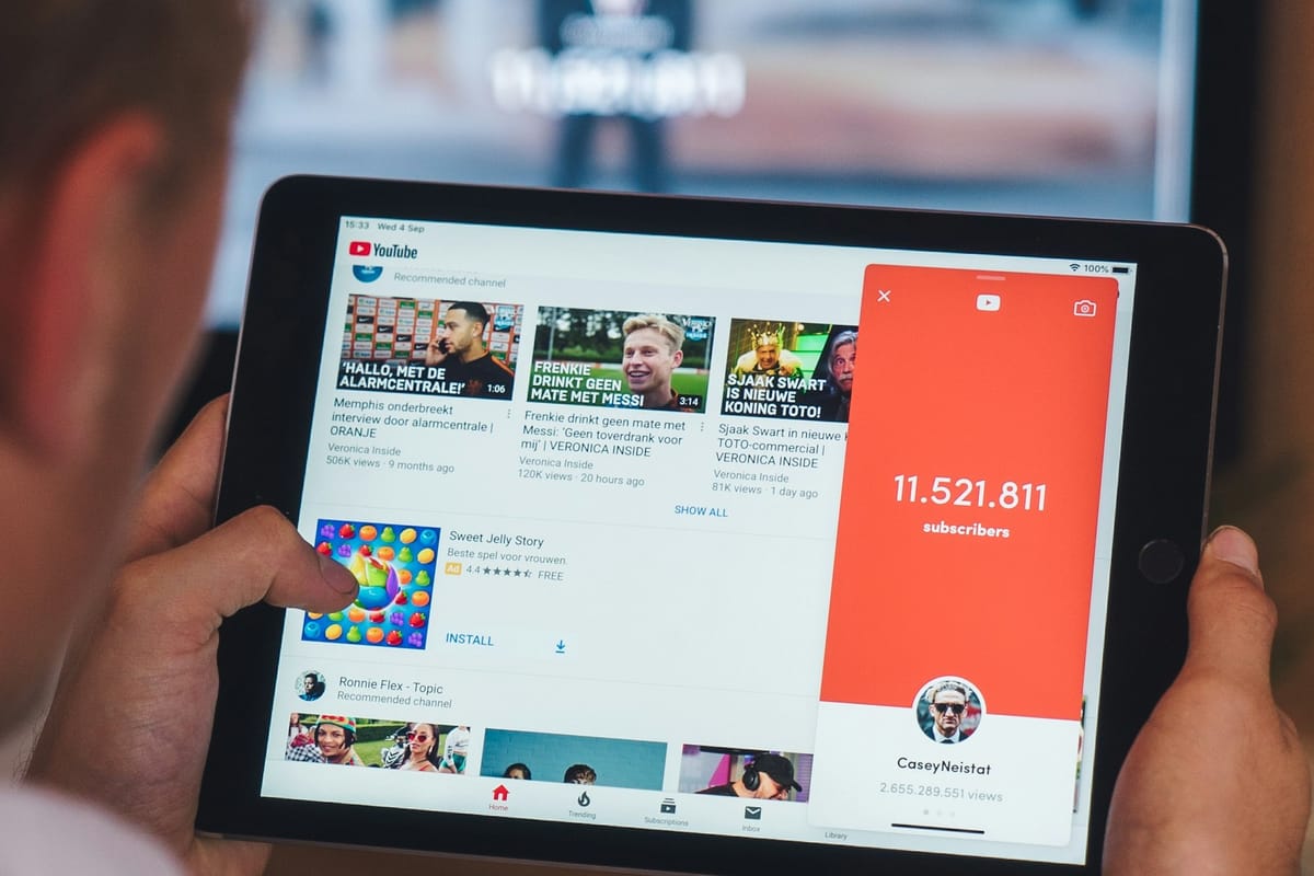
YouTube is quietly refreshing its video player, and it’s all about polish over drama. Starting this week, the platform is rolling out a “cleaner and more immersive” interface across mobile, web, and TV.
The new design introduces rounded buttons, translucent controls, and refined icons—a soft, modern aesthetic that feels more Apple-inspired than ever, though less theatrical than Apple’s Liquid Glass look in iOS 26. YouTube's goal here could be to make the viewing experience feel less cluttered and more centered on the content itself.
The update also tweaks how you interact with videos and comments. For instance, the double-tap to skip gesture has been refined to feel smoother and less intrusive, allowing you to navigate clips without breaking focus.
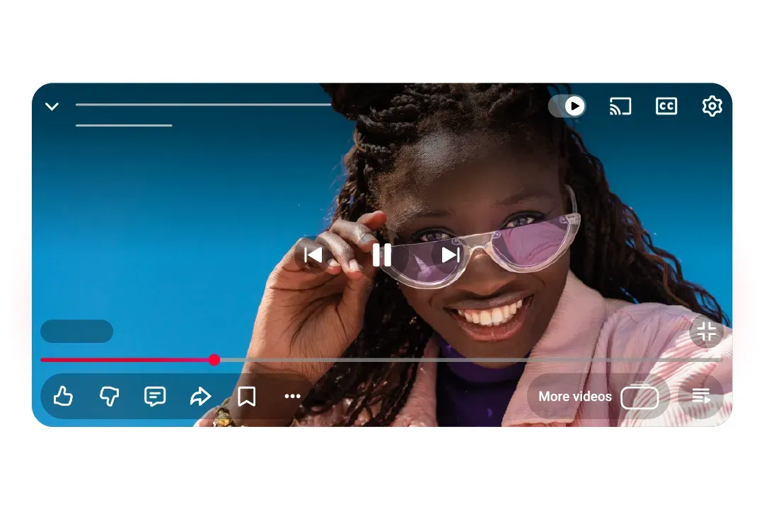
Comments will also now appear in a more structured, conversational layout, making replies easier to follow. And when you like certain videos, especially music ones, you’ll notice a small animated flourish, like a music note briefly dancing on your screen.
It’s not a radical overhaul, but the cumulative effect may be striking to users. YouTube could feel more intentional, modern, and calm—the kind of visual refinement that subtly improves how over 2.7 billion people watch, scroll, and engage daily.
YouTube’s update isn’t about reinventing the player but refining it. By trading clutter for clarity and noise for nuance, the platform is signaling a new design era built around comfort, consistency, and immersion. It’s a reminder that in the streaming wars, sometimes evolution speaks louder than reinvention.