If you use an Android phone, chances are you’ve tapped the Google Search bar more times than you can count. It’s one of the most relied-on widgets, and now, it’s getting a long-overdue design refresh. But while it looks cleaner, the update comes with a few quirks.
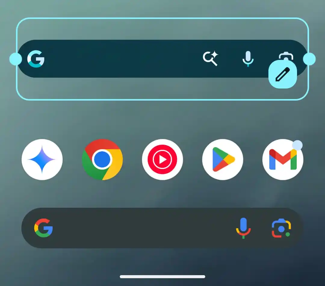
Previously, the Search bar was a simple pill-shaped tool with the Google “G” logo on the left and a cluster of shortcuts on the right, including Google Lens, voice input, and a custom shortcut. That shortcut, though useful, wasn’t exactly easy to spot. Now, Google is changing that.
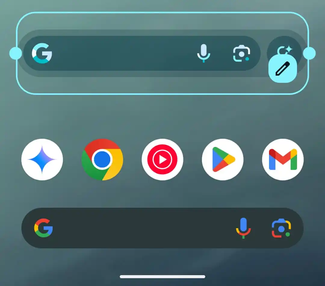
The new design entirely separates the "G" shortcut from the search bar. Instead of squeezing everything into the widget, the custom shortcut now sits as its own standalone button next to the bar. This not only makes it more noticeable but also easier to tap. The Search bar itself now only includes the “G” logo, voice input, and Google Lens.


Old search bar design vs New search bar design (via 9-5 Google)
To customise the new Google Search bar widget, tap the pencil icon to edit it. You’ll see an option to set a shortcut, which you can assign to quick actions like Translate, Song Search, Weather, Sports, Dictionary, Homework, and more.
Earlier reports hinted at a feature called “multi-shortcut,” where tapping the shortcut option would open a menu of all available tools. But that feature hasn’t been released yet, so for now, you can only choose one action at a time.
There is a small trade-off with the new design, the widget now takes up a 4x1 space instead of the previous 3x1 layout. That might be a minor annoyance for users who’ve carefully arranged their home screens, especially if you’re particular about symmetry.
That said, it’s all part of a bigger picture. This redesign ties into Google’s broader push for a more personalised, polished Android experience under the Material 3 banner. From the Search bar to the recent calling redesign for Google Voice, these are subtle tweaks, but they could make daily search use just a bit more efficient.

The redesign is a step in the right direction, but it stops just shy of full customisability. When (or if) the multi-shortcut option arrives, this widget might finally live up to its potential as a true one-tap command centre. Until then, it’s a welcome, if slightly incomplete, upgrade.


