

When you give an AI image generator an image to edit — swap one object for another, adjust the lighting — it usually regenerates everything from scratch. The composition shifts. The lighting changes. You spend more time negotiating with the AI than actually creating.
I’ve been testing OpenAI’s GPT Image 1.5 since it launched last week. On any given day, as I tinkered with the image generator, I kept Google’s Nano Banana Pro open in another tab for comparison — the model that reportedly sent Sam Altman into “code red” after topping LMArena’s leaderboard.
I didn't test the capacity or the speed. That I would leave for hot take comparison videos on TikTok. If AI is billed as the ultimate job killer, if AI is the thing that would replace all of us, creatives, I wanted to see that in action. So I focused on how it actually feels to use it for real work, and whether, as interns file for jobs as writers with the hope of using AI to do every single writing task given to them, GPT Image 1.5 could do the same for image creators.
Text rendering finally works
Most AI models fall apart when you ask them to render readable text. I started with a simple test. My first prompt was: a café scene with a chalkboard menu showing “Cold Brew - $5.00” and “Latte - $4.50.”
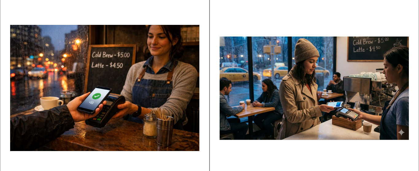
GPT Image 1.5 got it right. Clean text, proper spacing, correct dollar signs. But it also gave me something aggressively perfect - rain droplets in sharp focus, warm amber lighting, everything positioned like a stock photo. Nano Banana Pro’s version felt more like someone actually took the photo. Cooler tones, less dramatic composition, the messiness of reality.
That tells you who these tools are actually built for. If you need an image that communicates information clearly - menus, signs, product labels - GPT Image 1.5 is genuinely better. It opens up use cases that were basically impossible before: infographics, product mockups, anything where garbled text kills the whole thing.
If you need something that feels real, stick with Nano Banana. It captures the grit of reality, whereas GPT Image 1.5 smooths everything into a perfect, plastic version of the truth.
Style drift reveals the training priorities
Next, I asked for a 1950s travel poster with “VISIT NEW PROXIMA” in bold text and “Gateway to the Alpha Centauri System” below. For both, the big text came out perfect. But GPT Image 1.5's smaller text had a typo: “Gatewey.”
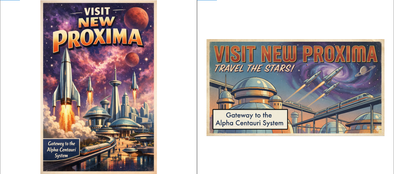
More interesting than the typo was the style drift. I asked for flat lithographic printing — that specific 1950s kind of look. What I got looked like a 1980s sci-fi book cover. Too detailed, too digitally painted, too modern. Nano Banana Pro understood the assignment: flat colours, vector-style art, and actual retro texture.
GPT Image 1.5 cared more about looking cool than actually listening to me. That tells you something about how it’s trained — optimised to generate scroll-stopping images that perform well in galleries of AI art, not necessarily to honour specific historical designs.
Being able to fix mistakes changes everything
Here’s where things get interesting. I generated a workspace photo: laptop, keyboard, succulent, headphones. Then I asked it to swap the headphones for a coffee mug and change the lighting to sunset tones.
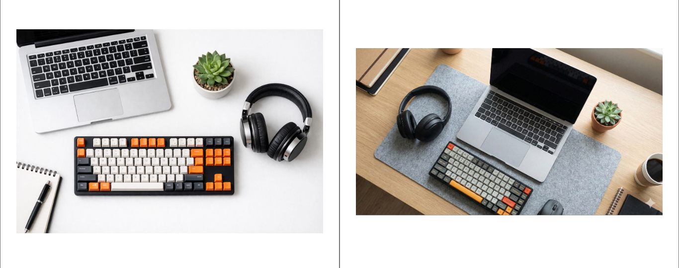
Every other AI tool I’ve used would regenerate the entire scene. The laptop would shift. The keyboard would be different. The spatial relationships would reset.
GPT Image 1.5 kept everything locked. Same positions, same angles. It only changed what I asked it to change. The lighting shift was heavy-handed — very much in the style of an Instagram golden hour, executed without breaking the composition.
AI hands (mostly) solved
Next, I gave it a harder test. The prompt was: a jazz pianist’s hands on a piano, with their face visible as a reflection in the glossy black wood.
The hands in the result are genuinely impressive. Five fingers, natural positioning, visible veins and knuckles, proper tension in the tendons. This is the first AI-generated hand that doesn’t immediately register as wrong.
However, the reflection reveals a consistent aspect of how GPT Image 1.5 operates. The face is crystal clear in the piano’s glossy surface, like perfect mirror glass. In reality, reflections on black lacquered wood are murky and ghostly. Nano Banana Pro’s version got that better, dark and blended into the surface.
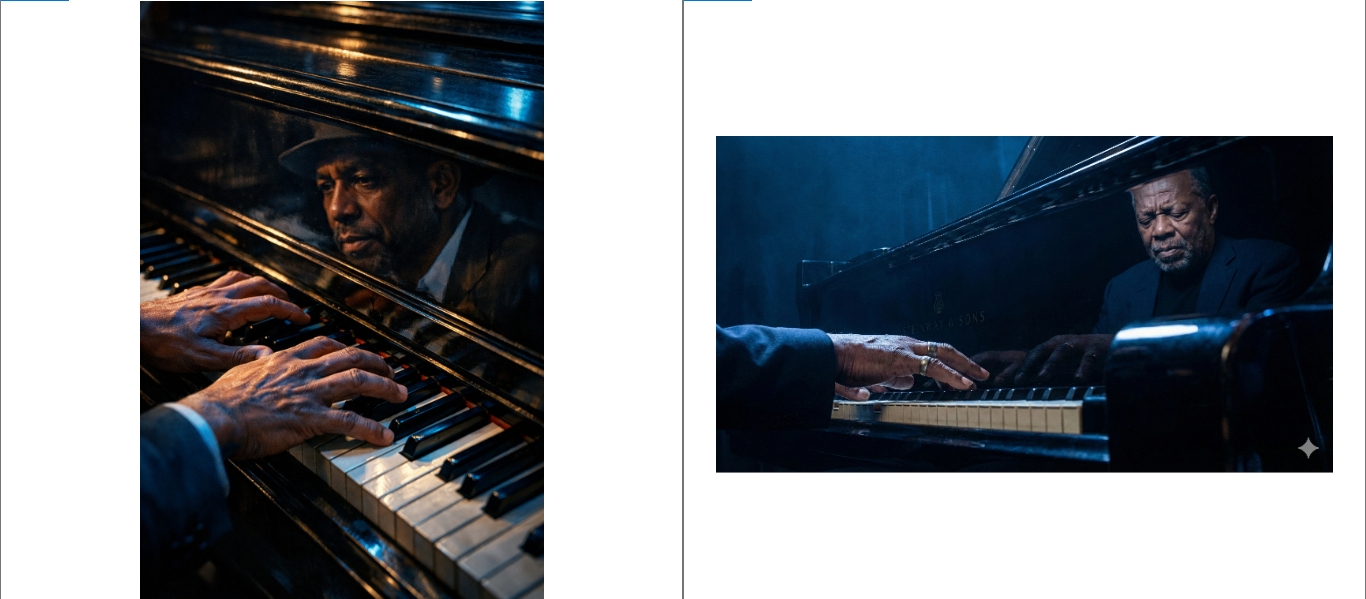
GPT Image 1.5 keeps choosing cinematic clarity over physical accuracy. It cares more about looking like a movie than looking real.
The story that we have been told about the creators of models like GPT Image 1.5 is that creatives should be wary; your time as some kind of cultural elite is almost over. In so many ways, a mean streak of all creatives being obsolete has been laced with this marketing.
Using GPT Image 1.5 is all the confidence that I need. It could not even spell "gateway."
At a time when taste has become captive to the algorithm, it takes those who truly appreciate art to not only understand but to first seek out the best creations. This, I’m not sure, is because they need to think better, but it’s because they lack the intuition. They are robots, and that is their strength, but it is also why they would never be the real thing.
As the American musician Lizzo put it in her Substack, “Because at the height of A.I., I still see us. I see the small clubs, packed shoulder to shoulder with humans hungry for an imperfect vocal. I see an open garage with rebellious teenagers tearing blisters into their fingers while learning guitar. I see the art of songwriting—storytelling, prose, iambic pentameter—being consumed as a rare luxury. Humans will always win.”
Like, for those looking to communicate better, AI can be useful, but for those looking for careers as creatives, think again.


