


Bitcoin breaks $60k, BTC ETF outflow turns wildly negative, a custodial wallet gets hacked, and within minutes, the market reacts. The first responders to get out of unfavourable trades and reduce their exposure to volatility are those with access to real-time data. But while static data feeds provide raw data, visual charts take data a step further by showing trends and correlations investors can detect at a glance.
Whether you're casually looking into how to track your digital assets or how to position yourself to respond strategically to market events that can impact your portfolio’s value, data visualisation tools are essential for effective digital asset monitoring.
Cryptocurrencies, Crypto ETFs, and the New Financial Instruments Defining Digital Assets Today
Investopedia defines digital assets as anything created and stored digitally with identifiable value. It also notes that blockchain technologies and cryptocurrencies have expanded the term. In modern-day finance, digital assets include financial instruments built on the blockchain. These include cryptocurrencies, crypto exchange-traded funds (crypto ETFs), and tokenised assets.
These assets play different roles and present different inherent advantages for investors. Tokenised assets, for example, allow real-world assets to be made available decentrally. Crypto exchanges and several mainstream financial institutions now offer tokenised forms of major currencies, commodities, equities, treasury bills and money market funds. So what's the big idea? Digital assets, including tokenised assets, provide decentralised access to traditional financial instruments, expanding accessibility to users from around the world. The settlement times are faster, acquisition costs are lower and transactions are completely immutable. The IMF and many others already think tokenisation could change the global financial architecture.
While tokenisation is still some time away from being fully adopted, many investors already integrate crypto and crypto ETFs into their portfolios. The new reality involves investors accessing stocks, commodities and other traditional instruments in addition to cryptocurrencies, all from a single interface.
But one challenge remains. How do you keep track of crucial data that may feature the next big profitable opportunity or warning sign of a crypto downturn that shouldn't be ignored? The answer isn't just gathering more facts and figures; it's finding an avenue to make sense of various data points. And that's where data visualisation tools come into play. Clean chart interfaces help traders map macro trends efficiently before deciding to use flexible derivative accounts for spread betting on cross-border equity baskets.
Data Visualisation for Digital Assets Monitoring
Data visualisation enables data to be represented visually. A well-constructed visual helps you see patterns and trends and allows you to identify outliers or anomalies.
In finance, the most popular data visualisations include charts, maps and graphs. These visual forms are great for understanding narratives in the market without having to deal with raw data extensively.
With traditional finance (TradFi) being integrated into the broader crypto ecosystem, investors need tools that capture both traditional and crypto assets. Here are the top data visualisation tools from legacy to modern financial platforms:
1. Bloomberg Terminal
The Bloomberg Terminal is an industry-leading platform that provides coverage of all assets across all markets. You'll find data visualisation tools with in-depth information for strategic investment decisions. The platform is a top choice for crypto investors who hold tokenised assets and want visual studies for deeper data analytics.
2. Yahoo Finance
Yahoo Finance provides a good balance between news reporting and data feed integration. You can view the crypto market via a table or heatmap view, allowing you to get a feel of the market at a glance. It's a good choice for investors who want to stay in the loop with current market movements without having to deal with deeper technical analysis.
3. London Stock Exchange Group (LSEG)
LSEG is a legacy financial institution that provides data insights across global markets. Data from LSEG form the basis of news headlines across the globe, starting with Reuters News, the platform's direct partner for publishing market data. You'll find deeper and uncommon visual data that unveils key trends that significantly move the market. LSEG is best for institutional investors watching out for how economic data connect with trends in the global digital asset markets.
4. TradingView
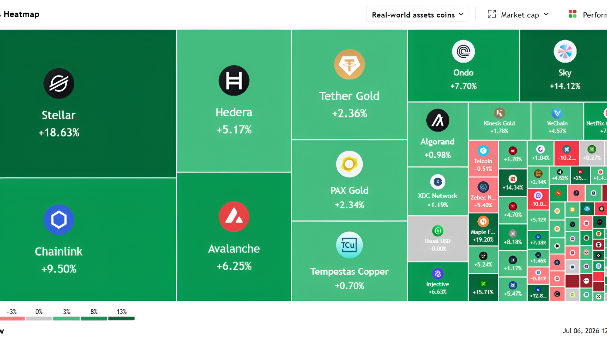
TradingView is a modern charting platform widely used across crypto exchanges, forex brokers, and other financial institutions. It's quite intuitive, efficient, and accessible across various devices. You'll find multiple visualisations that do a very good job of putting data in perspective. TradingView is best for investors who want an all-in-one platform to view digital assets' price history and performance. It's highly interactive and customisable, which makes it easy to draw out insights directly from charts.
5. Trading Economics
Trading Economics excels in curating economic and market data so investors can monitor trends across macro and micro levels. The platform provides brilliant data visualisations that make complex data easily digestible. At a glance, you can see which assets have gathered the most gains or losses across various timelines. Trading Economics also provides treemaps, scatter plots, and visual correlations. The platform is a prime choice for investors looking to find patterns and leverage correlation among digital assets for portfolio rebalancing.
6. CoinMarketCap
CoinMarketCap is among the most trusted sources for real-time digital asset data. A brief check-in to the platform shows the entire crypto market on one page. You'll find visual data such as the market cap’s line chart and the fear and greed index that instantly tells you what the general market sentiment is. CoinMarketCap is a good data visualisation tool for quick updates on prices and community sentiments.
7. CoinGlass
CoinGlass is a great market intelligence platform for scenarios where deeper analytics matter more than simple price trends. The platform provides global asset data analytics featuring funding rates, open interest, liquidation data, and specific metrics traders and investors watch closely in order to maintain healthy margins in open positions. You'll find visualisations in the form of real-time heat maps, line charts, and bar charts. CoinGlass is best for investors looking to perform on-chain analysis and monitor key digital asset metrics to maintain proper exposure in the market.
Why are Data Visualisation Tools Essential for Digital Asset Monitoring?
The crypto market is diverse, but even more diverse is the number of available metrics, indicators, and data points. Here are five reasons data visualisation tools are essential for digital asset monitoring:
1. Real-time Data Integration
Data visualisation tools are usually embedded with real-time data connections. Seeing how price and other metrics change with time in a visual format allows you to easily grasp the scale of real-time changes. So instead of simply getting raw data delivered in real-time, you also get a visual that illustrates the narrative inherent in the data.
2. Enhanced Data Comprehension

One of the main challenges investors face in the digital markets space is the sheer amount of data available and also the complexity with which they are designed. Interpreting weekly highs and lows can come easily, but that’s not usually the case with intermarket correlations or on-chain metrics like open interest. Data visualisation tools put the data into a visual perspective, allowing you to compare the same metric across several assets from a single interface. TradingView, CoinGlass, and Trading Economics provide supercharts designed for cross-asset analysis.
3. Quicker and Smarter Decision Making
The digital assets industry is gradually moving from its once highly volatile state. Still, volatility remains one of the main risks investors have to be aware of and prepared to combat. Using platforms that provide quality data visualisation tools is an added benefit that allows you to not only react as quickly as possible in the event of a market crash or boom but also react correctly. Access to data does not translate to smarter decision-making. Data visualisation ensures you understand the data, its depth, scale, and significance, which shapes your interpretation and the decisions you make afterwards.
4. Personalized Insights
Unlike data tools that are limited to raw data, showing static numbers and figures, data visualisation tools integrated into market data platforms are customisable and interactive. You can narrow down a basket of assets and view their price trends in various visual formats, all on a single page. Most data platforms also provide indicators and drawing tools, which you can use to detect hidden trends and infer insights from charts.
Get the Most Out of Data Visualisation
Market data platforms offer tonnes of data points, which can make monitoring your assets more of a chore than it needs to be. If you’re a beginner, watching an asset’s market cap, all-time high, or drawdown, and weekly performance are good places to start. For investors who have built a larger portfolio and have spent more time in the market, following up on Bitcoin dominance and exchange net flows becomes imperative. Professional and institutional investors add open interest, Total Value Locked (TVL) data, funding rates, implied volatility, and trading volume trends to their watchlist to monitor engagement and liquidity shifts.
It’s important to customise your dashboard to focus on data points that align with your investing strategy. Avoid complex visuals like scatter plots and 3D data renderings when looking for quick updates on trends. Instead, look for heatmaps, treemaps, or simple price charts for market updates. You can take data visualisations one step further by integrating AI to analyse charts. Providing additional context can allow AI to develop better insights. However, you should not make decisions based on AI summaries. Overall, data visualisation tools improve digital asset monitoring by providing a clear representation of data, whether complex or diverse, in a way that makes it easy to understand the underlying narrative.


