Every product designer eventually hits the "Frankenstein" phase. You start with a clean open-source icon set that covers the basics—home, settings, user, search. Then the feature list grows and you need specific metaphors: a drone, a DNA helix, a hand gesture. The open-source pack runs dry. You hunt on marketplaces, finding an icon that matches "close enough."
Six months later, your UI is a patchwork. Some icons have 2px strokes, others 1.5px. Some have rounded terminals, others are sharp. The visual language is broken.
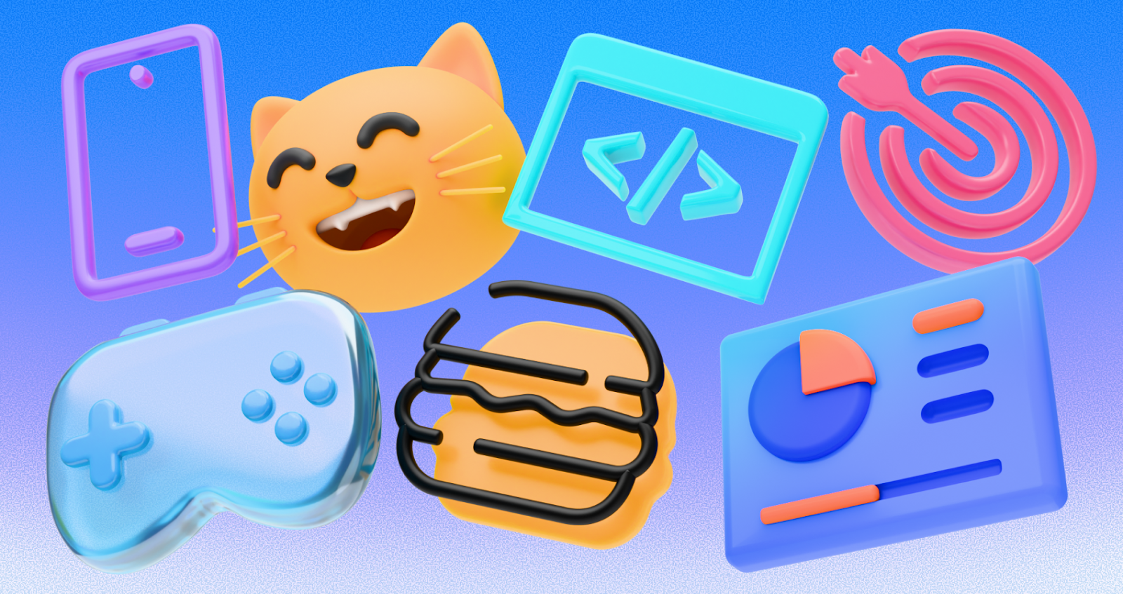
Icons8 fixes this mess. While many libraries compete on total volume, Icons8 competes on depth within specific styles. With over 1.4 million assets, the value isn't just having an icon for everything. It's having it available in 45+ distinct, consistent visual systems.
Find the exact icon you need without switching styles or rebuilding the set from scratch.
The Architecture of Consistency
Most teams can’t allocate budget to a dedicated iconographer. Icons8 treats icon packs as design systems rather than loose collections.
Pick a style—"Windows 11 Color" or "Material Outlined"—and you’re not accessing a few hundred glyphs. That single style can include 10,000+ icons. When a PM requests a niche symbol for a vertical, you don’t have to switch styles or draw from scratch.
Designers and developers can treat icons as a utility: choose the aesthetic that matches your platform (iOS, Android, Web), and the library scales with your product.
Scenario: The Cross-Platform Migration
A team ports an established iOS app to a web dashboard and an Android app. The original relies on Apple’s SF Symbols aesthetic.
In a typical workflow, designers export iOS assets and force them into Android. The result feels foreign. With the Icons8 Figma plugin, the team keeps the semantic meaning while swapping the visual language.
They use "iOS 17 Glyph" for mobile mockups. For Android, they switch to "Material Outlined" and find counterparts because naming and metadata stay consistent. For the web dashboard, they might use "Office" for a cleaner desktop look. The metaphors stay; the execution matches the platform.
Scenario: The Developer and the Rapid Prototype
Frontend developers often mock up interfaces before a designer finalizes assets. The pain is the download–edit–import loop.
Using the Icons8 web interface, a React developer searches "network server." The default black fails on dark mode. Instead of downloading an SVG and fixing it in Illustrator, they open the in-browser editor, apply the brand hex code, adjust padding, and copy an SVG embed fragment straight into the component.
The platform also offers CDN links, so you can serve assets remotely without bundling them—handy for rapid prototypes or A/B testing styles.
A Tuesday Morning with Pichon
Meet "Jules," a freelance UI designer on a deadline.
At 9:00 AM, Jules opens Pichon, the Icons8 Mac app in the menu bar. The client wants a "playful tech" vibe, so she switches to the "Color" style, searches "rocket," and drags a vector onto her canvas.
By 10:00 AM, the client wants something more corporate. Jules switches to "iOS 17 Outlined"; Pichon remembers the search; she drags the monochrome rocket over the old one.
Later she needs an animated loader. She filters by "Animated," grabs a Lottie JSON spinning gear, and drops it into the project folder—no browser tabs, no zip files.
Comparing the Alternatives
Vs. Open Source (Heroicons, Feather): Great to start: free, high quality, but shallow. A pack might have 200–300 icons. Once you need "medical chart" or "crypto wallet," you hit a wall. Icons8 charges for access, but you pay for not running out of metaphors.
Vs. Marketplaces (Flaticon, Noun Project): Infinite variety, poor consistency. A search for "cat" yields dozens of styles. Icons8 builds core styles in-house, so the line weight of a "cat" matches a "dog."
Vs. In-House Design: Maximum control, constant maintenance. Add a feature, draw a new icon. Icons8 acts like an outsourced, on-demand icon team.
Limitations and When to Look Elsewhere
Unique Brand Voice: The styles can feel "safe." If a brand depends on a quirky or hand-drawn look as a differentiator, standardized packs may feel clinical.
Free Tier Restrictions: Useful for mockups, limited for production. PNGs are capped at 100px, and the required link back to Icons8 can be a dealbreaker for client work.
Vector Access: Full SVG access sits behind the paywall (except some categories like Logos). If you need path-level edits, you’ll need a subscription.
Practical Tips for Power Users
Collections: Build a project set, bulk recolor with your palette, then download as a sprite or font to keep hex codes consistent.
"Simplified" toggle: It merges shapes for cleaner SVG code. Uncheck it if you plan to animate or edit parts later.
Requests: If you can’t find an icon, request it. If it gets 8 likes, it enters production.
Logos: Logos and Popular sometimes allow free vector downloads for official social and payment marks.
Icons8 focuses on the unglamorous but essential work of maintaining strict visual consistency across thousands of assets. It turns a stock site into a viable infrastructure component for modern product design.


