



Remember when Android phones were always playing catch-up, with major app features and software updates arriving on the iPhone first?
A lot has changed since then. Android has caught up in plenty of ways, but there's still one area where the iPhone often seems to get the nicer treatment: app design.
That's why this reported WhatsApp update caught my attention. The company could be testing a redesigned navigation bar on Android that looks much closer to the iOS version. Instead of sitting flush against the bottom of the screen, the navigation bar now floats above the interface with rounded corners.
It's a small visual change, but it signals that WhatsApp may finally be listening to Android users who have been asking for a cleaner, more modern interface. More importantly, it brings much-needed design consistency between WhatsApp on Android and iPhone.
 Sietoyo Esitikott
The changes WhatsApp is testing
The new navigation bar has appeared in WhatsApp beta for Android version 2.26.38.10. It features a floating layout with rounded corners that separates it from the main interface instead of attaching it directly to the bottom edge of the screen.
You can also see it in both light and dark themes, although it's much more noticeable in light mode.
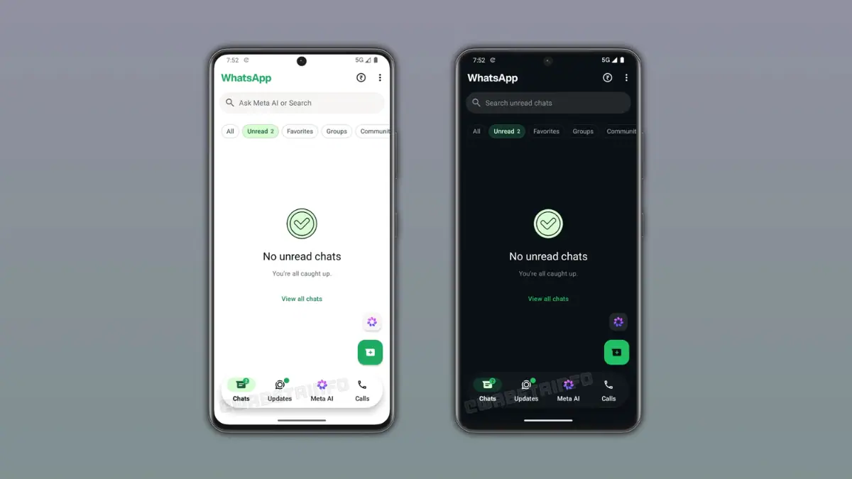
The look is clearly inspired by WhatsApp's floating tab bar on iOS, which arrived alongside Apple's Liquid Glass design language. However, WhatsApp isn't copying iOS exactly. The Android version keeps Google's Material Design styling and doesn't include the same translucent glass effect.
Subscribe for free to continue reading this article
Subscribe SubscribeAlready have an account? Log in