



The short version
Tech coverage moves quickly. A reader may open a startup funding story, compare a new device, scan an AI update, or check a product launch before deciding whether the information is useful. The writing matters, but the type system around that writing decides how easy the page is to trust.
For a publication that covers products, startups, funding, AI, gaming, careers, and emerging markets, the goal is simple: help readers move from headline to context to evidence without friction. That is where better typography becomes an editorial tool, not decoration.
The reader path
A compact diagram for tech editors
The diagram below shows the basic reading path a tech article should support: headline, context, evidence, and decision. The same path works for product explainers, funding coverage, app reviews, and market analysis.
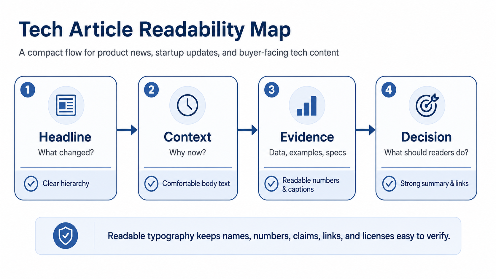
Where font choices affect trust
In tech publishing, the risky details are often small: product names, model numbers, price changes, funding amounts, dates, charts, and source labels. If those elements are hard to scan, the article feels weaker even when the reporting is accurate.
Practical places to check include:
- funding amounts, dates, and market figures;
- product names, feature tables, and specs;
- chart captions, image credits, and source notes;
- sign-up buttons, paywall labels, and newsletter prompts.
Brand examples with useful lessons
Custom font cases from large brands show how type can support consistency across many touchpoints. Domino’s Pizza customized TT Commons Pro into Dominos Sans Display and Dominos Sans Text, which is useful as a lesson in keeping web, app, and campaign communication aligned. Rocket uses WNTL and Bowtie, showing how one brand can combine accessibility with trust. SHIFTBRAIN Norms Variable shows how a customized variable font can support a digital-first identity.
For editorial and product teams comparing commercial or custom font systems, foundries such as typetype.org can be reviewed as part of a wider design and licensing audit, especially when the same type must work across articles, newsletters, charts, apps, and brand materials.
Licensing belongs in the newsroom workflow
Fonts are software, so a license defines how they may be used. A tech publisher may use the same font on a website, newsletter, infographic, downloadable report, event deck, video, or mobile app. The license should be checked before a redesign goes live, not after a campaign is already running.
Avoid these common mistakes
Common issues include:
- using decorative fonts for numbers or charts;
- mixing too many typefaces across articles and newsletters;
- hiding disclosures, credits, or source notes in tiny text;
- using a personal-use font in commercial publishing.
A quick note
Good tech writing needs clarity, speed, and evidence. Good typography helps that work travel further by making the evidence easier to read. For product-focused publications, readable brand text is part of how news becomes insight.


